Blog
Dated: Feb 12, 2018
Let’s take a look today at a section of a very famous painting:
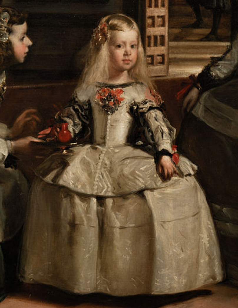
 The Infanta Margarita Teresa from Las Meninas, Diego Velázquez. 1656, oil on canvas. Museo del Prado, Madrid. Full, high-resolution picture available on the Prado Museum’s website.
This is part of Diego Velázquez’s 1656 masterpiece, Las Meninas.
Look at the detail in Velázquez’s painting: the brushstrokes in the hair, the shadows of the folds of the Infanta’s skirt the way light comes off the red cup and off the Infanta’s face. Naturally, the technique to create these effects were well-understood by Velázquez’s time — it’s not as if he was the only painter capable of rendering life-like figures — but I want you to pay attention to the sheer amount of work needed to produce this painting in comparison to the homage made by a much later Spanish master, also considered to be on the vanguard of art for his time:
 Las Meninas (Infanta Margarida Maria), Pablo Picasso. 1957, oil on canvas. Museu Picasso, Barcelona. Picture taken from Museu Picasso’s blog post, The chronology of Las Meninas of Picasso.
There are some obvious differences, of course. Picasso’s rendition of Las Meninas restricts itself to white, black and grey (other versions of Picasso’s Las Meninas are available in colour, but you probably shouldn’t be looking at a Picasso if life-like colour is what you want). The Infanta’s face is now characteristically Cubist: angular planes in different shades, rather than the smooth boundaries between light and shadow in Velázquez’s painting. Gone are Velázquez’s fine, blended brushstrokes — instead, we have Picasso’s broad bold lines.
It’s easy to deride modern art as lacking technique and craftsmanship compared to the masters of old. Which raises the question: what is it that Picasso’s version offers us, really?
Two posts ago, I looked at abstraction in computer engineering. Broadly speaking, abstraction in this sense is about isolating structure from operations. Transit maps show you the structure of the transit network while abstracting away the actual running of the buses and trains. In my last post, I laid out the distinction between icons and symbols in semiotics, and compared it to representation and abstraction in visual arts. An icon is more representational: it resembles its real-life counterpart in some meaningful way. As icons become more symbolic, they become more abstract, and they lose that representational quality. What these symbolic images gain, however is a greater clarity of structure.
If we go too far to the symbolic end of the scale, that structure becomes entirely arbitrary — recall that Charles Sanders Peirce characterised the relationship between “symbols” and their objects as being of an “imputed character” — but between those two extremes, there are plenty of possible ways to represent real-world objects in structurally interesting ways.
Let’s return to Velázquez and Picasso for a moment.
 The Infanta Margarita Teresa from Las Meninas, Diego Velázquez.
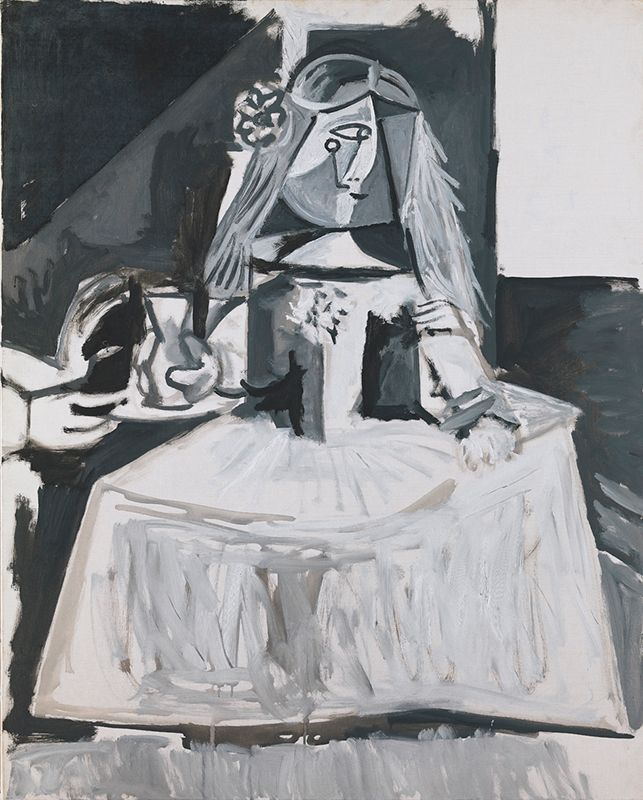 Las Meninas (Infanta Margarida Maria), Pablo Picasso.
Picasso has abstracted away a number of dimensions here. He isn’t concerned about the direction of light and shadow. The delicate folds on the Infanta’s skirt have been replaced by broad grey vertical brushstrokes that recall, but do not represent, shadow. In Velázquez’s painting, the sides of the Infanta’s torso are in shadow; Picasso effectively abstracts away shading (and the perspective that shading provides) by painting two fields of grey and black on the sides of the Infanta’s chest. Her cheeks receive a similar treatment. Neither does Picasso seem concerned about curves: the gentle arcs of the dress and skirt of Velázquez’s Infanta is replaced by direct and straight lines; the bulbous shape of the cup in the Infanta’s right hand transforms into an angular vessel.
By abstracting these elements away, Picasso reveals, essentially, a wireframe of the Infanta.
In fact, his sketches reveal an even more abstracted version of Las Meninas, including an even more brutally abstract Infanta:
 Crop of the Infanta Margarita Teresa from Sketch for “Las Meninas”, Pablo Picasso. 1957, blue pencil on paper (page from a sketchbook). Museu Picasso, Barcelona. Picture taken from Museu Picasso’s blog post, The chronology of Las Meninas of Picasso.
It looks like a child’s drawing, doesn’t it? That’s perhaps one of the greatest mysteries of the human mind — that children, looking at a scene or a painting, even one as intricate as Las Meninas, will instinctively isolate shape and colour, and abstract away everything else. Never mind the actual substance of the pigment on the canvas! We don’t see blue crayon on paper or ochre on canvas — the structure of the image exists in our minds as something independent of the individual brushstrokes. And that’s part of the genius of Picasso, Braque, and the rest of the Cubists: they painted not according to the perception of the eye, but according to the perception of the mind.
Going Further: Isolating Colour
Colour has taken possession of me; no longer do I have to chase after it, I know that it has hold of me forever… Colour and I are one. I am a painter.
— Paul Klee, 1914
What happens when you remove shape from the equation, and leave only colour?
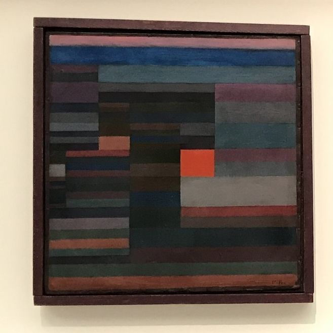 Feuer Abends (Fire in the Evening), Paul Klee. 1929, oil on cardboard. Museum of Modern Art, New York City (picture taken while the work was on loan to the Fondation Beyeler, Riehen).
Paul Klee’s Fire in the Evening is a painting that, without its title, is difficult to anchor to the real world. Nonetheless, there are things we can read from it, if we know what to look for. Klee’s paintings has shapes, of course, but no representational shapes. Even Picasso’s Infanta is recognisably a girl wearing a dress, but all Klee gives us are rectangles. That does not mean that Klee has completely left the realm of representation. He just happens to have abstracted away much more than most artists.
The painting features two keys axes of contrast. First, there is a series of horizontal bands of colour, broken by a series of implied vertical lines. Secondly, there is the fact that this painting’s colour palette includes a variety of dark or dull shades, and a single field of bright, scarlet red.
Klee’s innovation here is not the use of red for fire — that is trivial. Instead, it is in his recognition that in a fire scene, it is not the colour per se that the eye is drawn to, but the contrast. The most arresting images of fire are created not by the colour of fire itself, but by the contrast of light against dark, which is why you rarely ever see great photos of fires taken during the day. Klee tapped into the fundamental structure of fire imagery, and abstracted away nearly everything else.
We don’t know where Fire in the Evening is set, and yet there is an unshakeable feeling that the painting we are looking at is a landscape. Why? Here’s my theory: the dominance of the horizontal lines is a primal expression of the structure of the landscape. All landscape compositions are constructed relative to the horizon.
So, instead of painting a landscape, Klee paints a proto-landscape, an underlying representation (sorry, linguistics joke) of all landscapes, with brown and green bands dominating the lower third of the painting representing the land, and blues and pinks dominating the upper two-thirds. The vertical lines that interrupt this horizontal composition, then, represent objects that interrupt the horizontality of landscapes, such as buildings or trees.
The title Fire in the Evening, at least, gives us a visual image we can use as a territory to map Klee’s painting onto. In some other cases, though, the object of Klee’s painting is not a landscape, but a feeling:
 Blühendes (Flowering), Paul Klee. 1934, oil on canvas. Kunstmuseum Winterthur (picture taken while the work was on loan to the Fondation Beyeler, Riehen).
Here, Klee again uses a contrast of dark and light colours. Unlike Fire in the Evening, however, the contrast isn’t representational. Nobody goes looking for blooming flowers in the dark. Instead, the relationship between the technique — colour contrast — and the subject matter of the painting is indexical and metaphorical: light, spreading from the centre of the canvas to its edges, as a visual metaphor for spring after winter, and for creation out of darkness. The fractal-like quality of the small squares expanding outwards and into the larger squares contributes, too, to the sensation of growth. This, too, is an abstraction: Klee has found a way to express the structure, the form of the idea of “flowering”, rather than a representation of it.
Contrast is not the only technique that Klee used. Klee was an accomplished musician, and he understood that harmony was just as valuable a tool as contrast and dissonance:
 Harmonie der nördlichen Flora (Harmony of the Northern Flora), Paul Klee. 1927, oil on cardboard. Zentrum Paul Klee, Bern (picture taken while the work was on loan to the Fondation Beyeler, Riehen).
In Harmony of the Northern Flora, Paul Klee arranges his rectangles of colour such that they create an impression of vibrant coherence. It isn’t the case that he hasn’t used contrasting colours — we find blue next to orange, green next to red, yellow next to purple — but unlike Fire in the Evening or Flowering, the colours have been arranged not to draw immediate attention to one particular section of the canvas.
The arrangement of rectangles, too, contributes to this coherence. While Fire in the Evening created the bracing contrast of horizontal and vertical, and of bright red against dark tones, Harmony of the Northern Flora does not generate this effect. Somehow, the black lines outlining the rectangles serve to pull the different colours together, drawing attention to their geometric unity rather than inviting contrast. The differently-coloured and differently-sized fields create visual interest without creating tension.
What is it that Paul Klee has done here?
Let’s take a look at the master painter of northern flora:
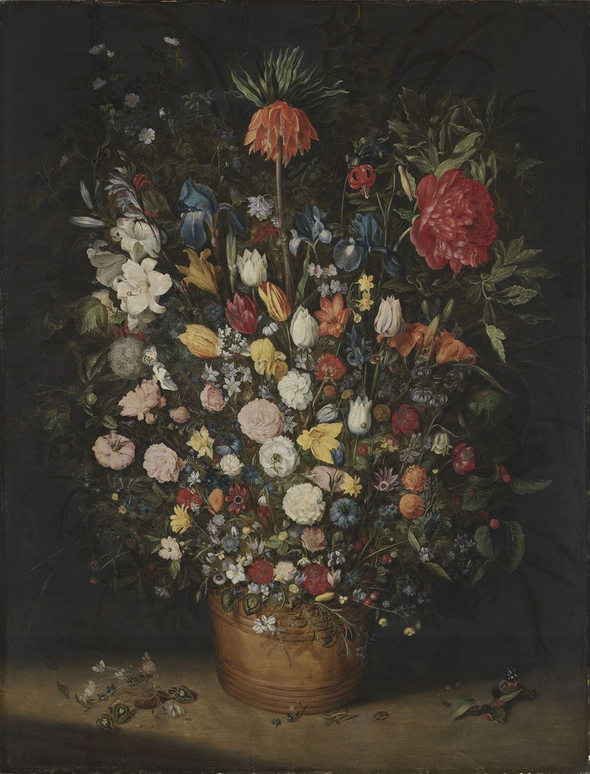 Großer Blumenstrauß (Big Bouquet), Jan Brueghel the Elder. 1606/7, oil on wood. Alte Pinakothek, Munich. Picture taken from the Pinakotheken collections website, used under a CC-BY-SA-4.0 license.
Jan Brueghel’s still life of flowers is representational and iconic. It resembles a bouquet of colourful flowers as they might exist in real life. Klee abstracted away everything but colour and geometric composition.
Recall that in the evolution of the Chinese writing system, the iconic logograms, with their curved lines and emphasis on shape, slowly became more abstract and symbolic, with lines becoming rectilinear and the relationship between the lines taking precedence.
That is what Picasso did to Velázquez, and what Klee did to flowers.
The Difficulty of Abstract Art
This is the challenge of abstract art. Because abstract art does not readily recall real-world scenes and images, it demands more of us as viewers. The work does less of the showing, so we have to do more of the seeing. And because abstract art seems to require less of the technical skill that representational art does, it is easy for us to dismiss it as juvenile, lazy or unskilled, when in fact it takes a supremely conditioned eye and mind to put on the canvas exactly enough to convey a sensation or an image, and no more.
The more abstract a signifier is, the more arbitrary its relationship with its signified, and the more malleable the sign. This is what makes abstract art so pliable and so famously “subjective”. Precisely because it is divorced from its real-world referent, abstract art allows us — invites us, even — to impose our own meanings upon it.
This is not a bug, but a feature: it forces the viewer to take part in the act of meaning-making.
Well – at least this is the meaning I’ve constructed out of abstract art, anyway. This is the only way I’ve managed to approach abstract art in a way that makes sense to me.
Dated: Feb 4, 2018
In my last post, I wrote about abstraction in computer engineering. In today’s post, I want to start laying the foundation for looking at abstraction in two other fields, in visual arts and in linguistics. To do that, we’ll start in a place where the two fields overlap: writing systems.
First, we need to define our terms. The study of writing systems falls within the field of semiotics, which has two intellectual fathers, Ferdinand de Saussure and Charles Sanders Peirce. In his Course on General Linguistics, Saussure articulated his concept of the “linguistic sign”:
For some people, a language, reduced to its essentials, is a nomenclature, a list of terms corresponding to a list of things… This conception is open to a number of objections… A linguistic sign is not a link between a thing and a name, but between a concept and a sound pattern. (trans. Roy Harris)
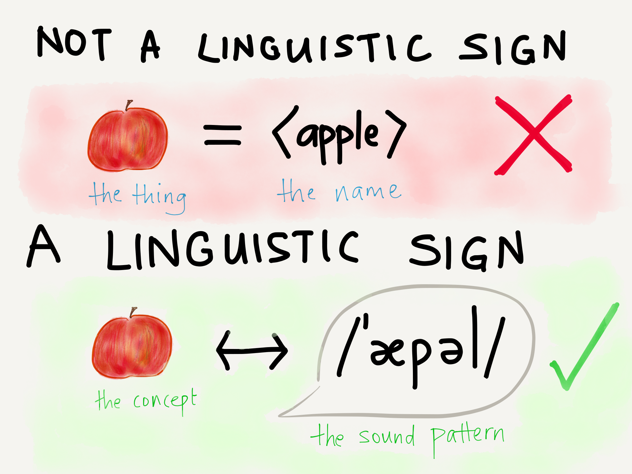 Linguistic sign = link between concept and sound pattern
Several paragraphs later, in order to avoid the possibility of a “sign” being conflated with its constituent “sound pattern”, Saussure replaces “concept” and “sound pattern” with signifié”, “signified”, and signifiant, “signifier” (Roy Harris’s translation renders these as “signification” and “signal”, but I’ll go with “signified” and “signifier”, which is the more well-known rendition.)
 Sign = link between signifier and signified
Note that Saussure’s definition of a sign here is restricted to what he calls linguistic signs. He acknowledges that his approach can be used in semiotics, but his chief interest (at least in the Course) is in applying the concept of the sign to linguistics.
For Saussure, the linguistic sign has the particular property of being arbitrary. Saussure in fact asserts that “the link between signifier and signified is arbitrary,” and contrasts signs with symbols:
… it is characteristic of symbols that they are never entirely arbitrary. They are not empty configurations. They show at least a vestige of natural connection between the signifier and the signified. For instance, our symbols of justice, the scales, could hardly be replaced by a chariot.
 Scales are a symbol (not a sign) of justice. Cutlery is a symbol (not a sign) of eating.
Here we run into a problem of terminology. The other founding father of semiotics, Charles Sanders Peirce, used the term “symbol” in an entirely different way:
… There are three kinds of representations.
1st. Those whose relation to their objects is a mere community in some quality, and these representations may be termed Likenesses [the more common term is “Icons”].
2nd. Those whose relation to their objects consists in a correspondence in fact, and these may be termed Indices or Signs.
3rd. Those the ground of whose relation to their objects is an imputed character, which are the same as general signs, and these may be termed Symbols.
(from On a New List of Categories)
Maybe it’s because I’m more familiar with the substance of Saussure’s work than with Peirce’s, but I find Peirce’s language very opaque and hard to grasp. Peirce’s theory is expansive and detailed, but I’m not trying to lay out an entire theory of semiotics here. I just want to define the terms “sign”, “icon”, “index” and “symbol” for our purposes.
So, to make life easier for everyone…
| Signifier |
According to Peirce |
According to Saussure |
What I’ll Call It |
| 🍎 |
an icon of an apple: the signifier shares a Likeness with its signified. |
a symbol of an apple: the signifier has a natural relationship to its signified. |
icon |
| 🍴 |
an index of eating: the signifier does not depict eating itself, but instead depicts the instruments of eating, which point to the act of eating. |
a symbol : the signifier has a natural relationship to its signified, even if one step removed. |
symbol |
| ⚖️ |
an index of justice: the signifier does not depict justice itself, but instead depicts a metaphorical instrument of justice, which points to justice. |
a symbol of justice: the signifier has a natural relationship to its signified, even if metaphorical. |
symbol |
| ⚠️ |
a symbol of danger: the signifier has no natural relationship to its signified. If we think “danger” when we see the signifier, it is because we have imputed the signifier with the character of “danger”. |
A sign of danger: the signifier has an arbitrary relationship to its signified. If we think “danger” when we see the signifier, it is because we have associated it with this signifier purely by convention. |
symbol |
This is an analysis of Peirce through the lens of Saussure, which is perhaps unfair to Peirce. Peirce defined “signifier” more precisely than Saussure did, and included an “interpretant” in his model, which Saussure left out. We don’t have to go there. (Yet.)
What do these signifiers represent?
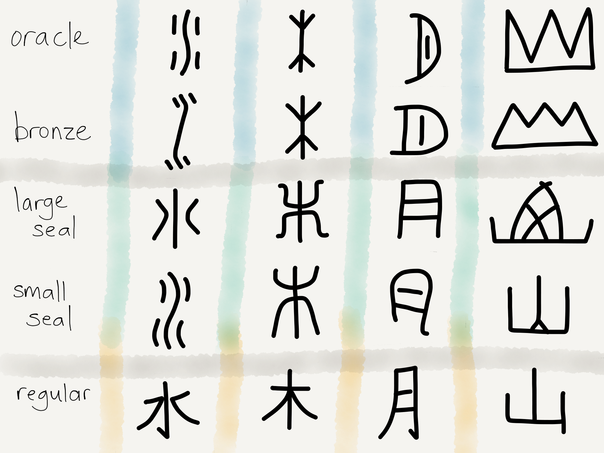 Evolution of the Chinese writing system
This charts the evolution of the Chinese writing system. Oracle bone script and bronzeware script were contemporaneous, as are large seal script and small seal script. Regular script is what modern Chinese writing looks like.
From left to right, the logograms are the words for “water”, “tree” or “wood”, “moon”, and “mountain”. In all of these cases, the logogram begins as an icon and evolves to become a symbol.
You might argue that 木 and 山 still have iconic qualities, and given our definitions of “iconic” and “symbolic”, that’s not an unreasonable argument. Icons and symbols, as we have defined them, exist on a spectrum, not as binary states.
Icons are primarily representational : their relationship with their signifieds is that they resemble their signifieds in some recognisable way.
Symbols, on the other hand, are primarily abstract : their relationship with their signifieds is not necessarily recognisable, and the meaning of symbols is one established through repeated, collective use.
Representational art and abstract art are often contrasted with each other, but our definitions of icons and symbols suggest that representational and abstract art, too, exist on two ends of the same scale:
 The dichotomy between representational art and abstract art is similar the spectrum between iconic and symbolic representation.
(Note that in this model, the symbolic is abstract, but the abstract is not always symbolic — think about Jackson Pollock’s No. 5, for instance. Additionally, in this model, art that is rich in symbolism is not necessarily abstract. For all its symbolism, Dalí’s Persistence of Memory falls on the representational end of the spectrum; his tree looks like a real-world tree and his melting clocks look like real-world melting clocks.)
Remember the characterisation of programming languages as being either low-level and “close to the metal”, having a low level of abstraction, or high-level and having a high level of abstraction? A low-level language shows you — and makes you take care of — every little detail of what’s happening at the level of the CPU. A high-level language removes various aspects of what’s happening at the CPU level from your field of view — it abstracts them away, so that you can work more efficiently.
That’s what happens with icons and symbols, too. As icons are used more and more often, they morph. All the irrelevant details are removed, leaving only what is essential for communicating the intended meaning, and edge towards the symbolic, the abstract end of the spectrum.
In the case of the Chinese writing system, the movement away from the representational to the abstract was an entirely organic process. As each generation of calligraphers followed another, the calligraphic style of the Chinese writing system evolved and arrived at the current system (whether the “current system” is Traditional or Simplified is a different matter, and the evolution and differences between the two are worth exploring another time.)
Now the question is: as representational, iconic signifiers gradually become abstract, symbolic signifiers, what exactly is it that gets abstracted away?
A writing system differs from visual art in one key respect. If I draw a river, my drawing of a river is the signifier, and the thing it signifies is the idea of a river that looks reasonably similar. Looking at it, my river drawing will bring to your mind an image of what such a river might look like in real life.
 Does it? Does it??? (I had to draw something myself instead of choosing a Turner painting because it’s not clear if photographs of old paintings are considered to be in the public domain.)
Now, when it comes to writing systems, here’s what Saussure has to say:
A language and its written form constitute two separate systems of signs. The sole reason for the latter is to represent the former. (emphasis mine)
With a writing system, the signified is not an image of the thing that exists in the real world. The signified is the sound pattern of the word, the set of sounds that make up the spoken word. The sound pattern of the word, if you remember Saussure up top, is itself a signifier that refers to the concept that’s brought to mind when you hear the word. (You could say that a writing system is already one level of abstraction removed from drawing. Ba-dum-tss!)
 From the concept of water to the sound of the concept to the written form of the sound.
If we look at the progression of the Chinese writing system, the signifiers start out with curved lines. The strokes can move in any direction. It is the shape of the signifier that matters; the relationship of individual strokes to one another is less important. Even then, there’s already a clear difference between the oracle bone script and the bronzeware script. The writing medium probably has something to do with this: the bronzeware inscriptions were made on wet clay molds before the bronze was cast, allowing for a greater level of detail and the use of more curved lines. On the other hand, oracle bone script tends to favour straight lines and simplified logograms (my preferred term for Chinese characters). The process of abstraction is already visible, even at this early stage.
 I saved you the trouble of scrolling up.
A writing system needs to have certain properties. It needs to be easy to reproduce, and easy to parse visually. The Chinese writing system has thousands of logograms, all of which have to be distinct from one another. The vast majority of them are not iconic or ideographic (they’re modified rebuses — another type of abstraction that we’ll discuss in a moment), but they still need to be visually identifiable at a glance. If you tried to create a writing system that oriented itself towards creating hundreds, if not thousands, of iconic shapes, readers and writers would spend an inordinate amount of time in the nitty gritty of ink and paper, trying to distinguish one shape from another.
Well, once the logograms are widely known and recognised as corresponding to a spoken sound, the link between the iconic signifier and its eventual signified can be broken. No longer does a logogram have to recall its real-world referent: readers and writers of the language only need to associate the logogram with the corresponding sound in the spoken language. This gives the writing system room to evolve in a more abstract direction. Logograms need not be iconic. This turns out to have a major effect on the Chinese writing system, as we will see in a second.
We can see that as the writing system evolves, the lines straighten and become rectilinear. That makes sense: straight lines are easier to reproduce consistently than curved lines. Moreover, it’s not the shape of the logogram that matters now, it’s the strokes and their relationship to one another. That makes it possible to create thousands of logograms that are easy to distinguish from one another.
Effectively, the rectilinear scripts abstracted shapes and curves into lines, angles and hooks. This prefigures the kind of abstraction we later see in abstract art.
Rebuses and Modified Rebuses
Consider the numbers 1 to 4 in Chinese:
 one 一 two 二 three 三 four 四
It’s easy to see how the logograms 一,二,三 came about: they’re visual ideographic representations of the concept of 1, 2 and 3. What about 四?
It turns out that 四 is a rebus. Here’s the historical evolution of the written form of “four” in Chinese:
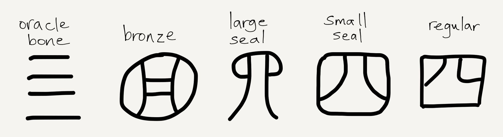
The reconstructed Old Chinese pronunciation of 四 is *hljids (if you’re curious about what that sounds like, as I was, you can listen to the Old Chinese numbers here. The Chinese languages have a large number of homophones and near-homophones, different words that share the same pronunciation or are similar-sounding, and this proved to be a key factor in the development of their writing system. As far as we know, *hljids is also how the Old Chinese word for “nostrils” was pronounced.
四 was originally a logogram, probably iconic, for the homophone *hljids, meaning “nostrils”. Oracle bone script and bronzeware script were contemporaneous, and we can see that the Chinese used four horizontal lines 亖 in the style of 一,二,三 when writing on the hard oracle bone, but opted for the homophone 四 when writing on the more forgiving soft clay. Presumably, the difficulty of distinguishing 三 from 亖 at a glance led writers to favour the use of the logogram 四 for 4 instead wherever possible, and eventually 四 became the standard form while 亖 fell out of use.
The appearance of the rebus is significant. Just as a high-level programming language abstracts away entire layers of nitty-gritty computational data that slows humans down, rebuses in the Chinese writing system abstract away the need to create an iconic or ideographic logogram to represent each concept. We can think of this in terms of layers of abstraction, too:
 The Writing System Layer Cake
The sound pattern layer is an abstraction sitting on top of the concept layer, and the logogram layer sits on top of the sound pattern layer. The presence of the sound pattern layer between the logogram layer and the concept layer is what allows the logograms to be divorced from the concepts they ultimately signify. It allows all the signs in the chain to be purely arbitrary.
How would a reader differentiate 四 the number and 四 the body part, then? At first, there was no visual distinction made, and readers simply relied on context. This introduces a different difficulty — ambiguity — but that is mitigated by the fact that “four” is a far more common word in most languages than “nostrils” is.
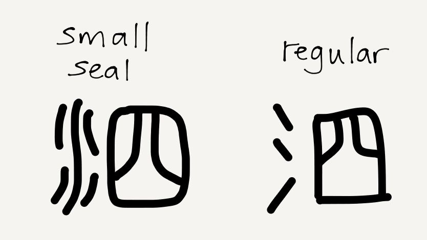 The evolution of the word “mucus” in Chinese writing.
Over time, two things happened. One was that the word *hljids “nostrils” underwent semantic change and came to mean “mucus”. The other was that the association between 四 and “four” became so strong that when it was necessary to write “mucus”, writers started to disambiguate the logogram by adding 水, “water”, (氵in clerical and regular Chinese script) to the left of 四 to indicate the intended meaning of “mucus”. This created the logogram 泗, a modified rebus : the rebus signifies the sound pattern, and the modification (usually called the radical) indicates which of many possible concepts is intended. (Note that because of the rebus component, the resulting modified rebus is still an arbitrary sign.)
The average educated Mandarin speaker knows about 8,000 logograms, and the overwhelming majority of them are modified rebuses like the above. Interestingly, modern word processors have obviated the need to remember how to write all of them. People typing in Chinese type a romanised form of what they want to say, and a choice of logograms pops up; they only need to know how to recognise the logograms they want to use. Without regular handwriting, a phenomenon known as character amnesia occasionally surfaces, where the writer forgets how to write the logogram they meant to write. That’s not surprising, since the modern computer-based workflow effectively creates an alternative written layer, based on Mandarin’s relatively simple and constrained phonology, that competes with the expansive logographic system:
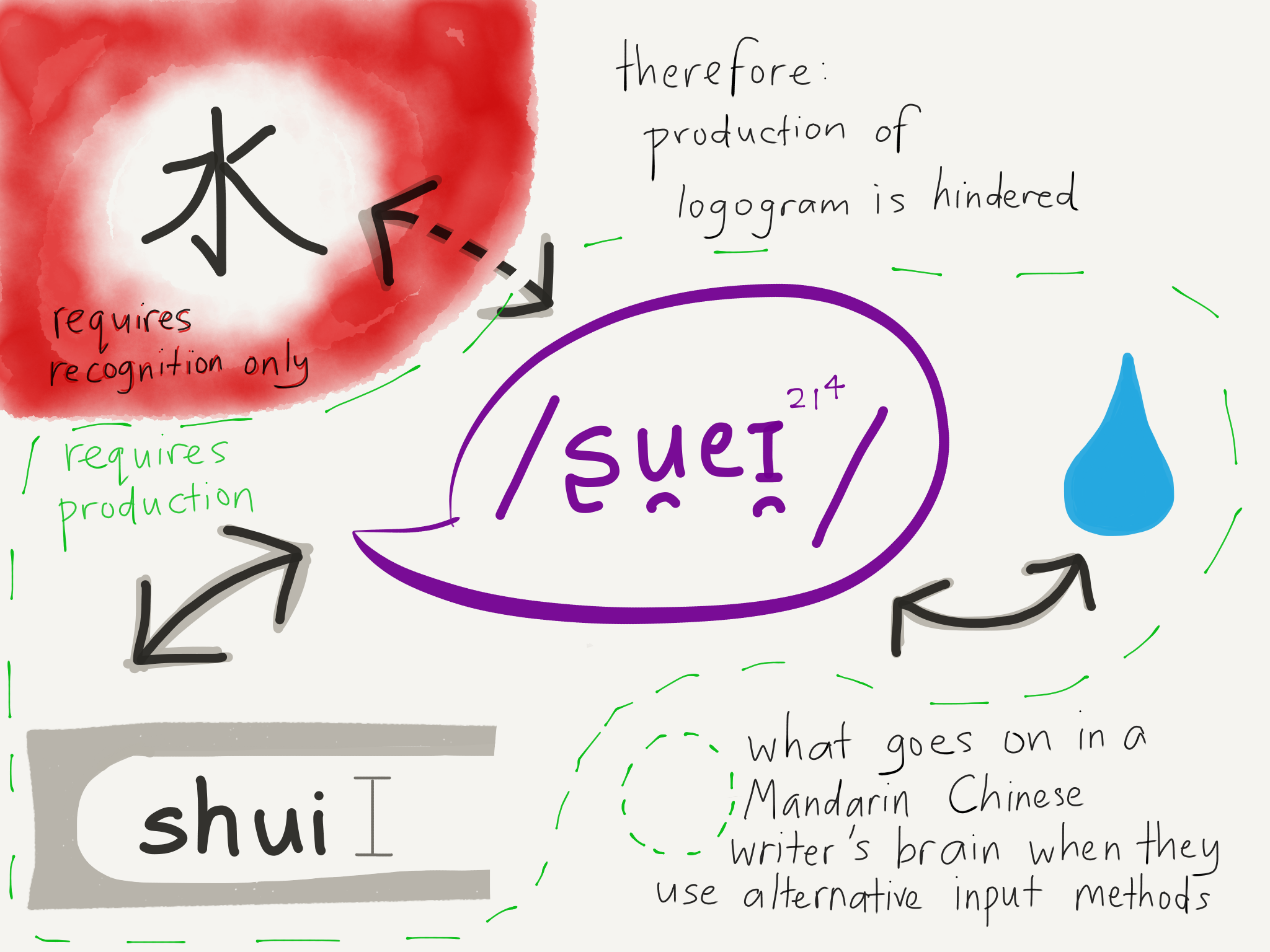 Much easier to type hanyupinyin and choose from the logograms the computer offers to you, than it is to write logograms from memory!
Writing is not a natural linguistic facility for humans. Children who grow up around language will learn to listen and speak, or to sign and understand sign language, but reading and writing have to be expressly taught. Somehow, the human brain can maintain a lexicon of tens of thousands of words in the form of sound patterns, but it cannot maintain a library of tens of thousands of separate written icons or symbols to represent those sound patterns. It has to reduce that written inventory to a few thousand at most, and even then vanishingly few writing systems have that many (remember, English has just 26).
Abstraction, which allows us to remove entire dimensions of temporarily irrelevant information, is what helps us do it.
Dated: Jan 28, 2018
The essence of abstractions is preserving information that is relevant in a given context, and forgetting information that is irrelevant in that context. – John V. Guttag (from Introduction to Computation and Programming Using Python)
I started learning programming when I was 10, when I walked into my father’s study late one night and found him typing away using a program I didn’t recognise.
“What’s this?” I asked.
“It’s Visual Basic,” he replied. “I’ll show you tomorrow.”
The next day, he sat me down in front of the computer and showed me how to draw a button on a window in Visual Basic that would say “Hello World!” when I clicked on it. I was hooked. I was still a Windows user at the time, and being able to create my own program that looked exactly like a real Windows program was such a heady feeling.
There was one step I didn’t understand, though. Before my program would run, I had to compile it.
“What does ‘compile’ mean?” I asked.
“It means the computer has to turn what you’ve written into a language the computer can understand,” my dad said.
As I learnt more about programming, I heard terms like “assembly language”, “low-level” and “high-level”. I gathered that “assembly” was a low-level language, but when I asked my dad what that meant, he answered rather cryptically that a low-level language was “close to the CPU”, or something like that.
Ones and Zeros
In high school physics, we learnt about these things called logic gates, which always seemed rather out of place to me in the physics curriculum. We’d get a diagram like this:
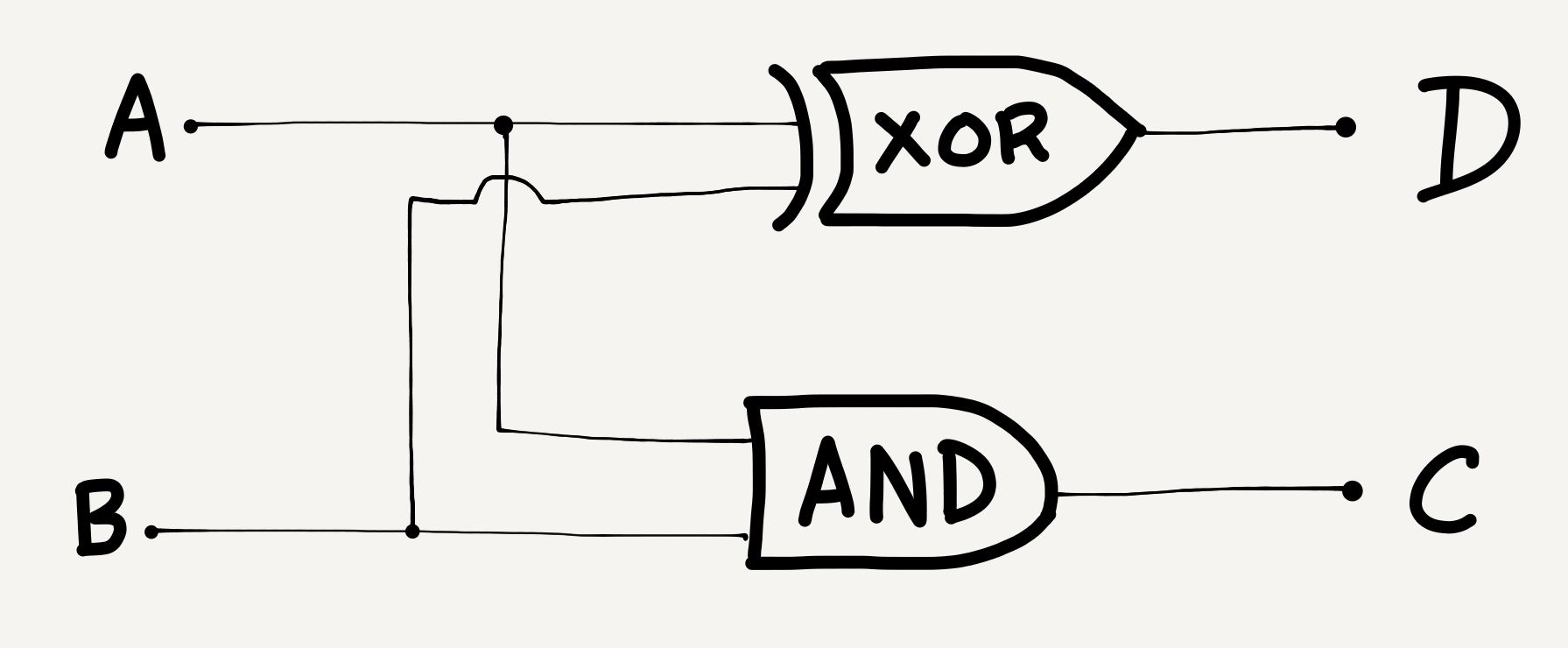 A random circuit of logic gates
and we’d have to fill in a “truth table” like this:
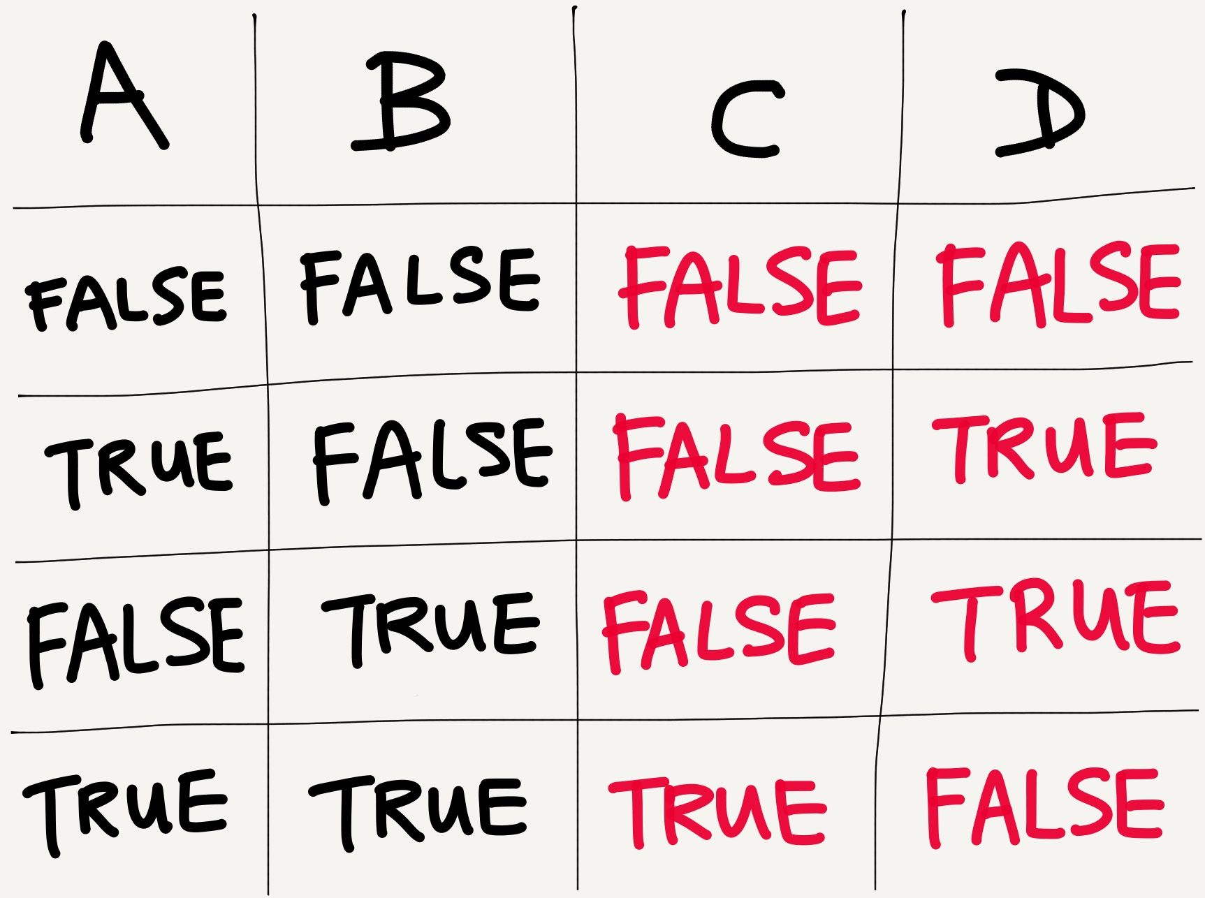 Not much physics going on here… or is there?
The logic gate diagram consists of an XOR gate and an AND gate. Individually, these gates simply take two inputs, and give one output. The AND gate outputs TRUE if both its inputs are TRUE, and FALSE otherwise. The XOR gate outputs TRUE if both its inputs are the same, and outputs FALSE if its two inputs are different.
The thing is, we were working out truth tables for these abstract things called logic gates, but nobody in high school ever showed us what a logic gate looked like. If they had, we’d have understood that logic gates were electrical components, switches that turned low voltages (representing FALSE) into high voltages (representing TRUE), or that took two different voltages and produced a third, based on what those two input voltages were.
Because of this, the chapter on logic gates never felt like physics to me. All of it seemed to rest on an understanding of logic, not of physical phenomena. Logic gates probably snuck in there because logic gates are critical to how computers work, and presumably at the time the curriculum was designed, computer science was considered to be a subdiscipline of engineering, and was therefore a closer cousin of physics than of mathematics. Anyway.
What’s 1 + 1?
2, you might say. Well, you’d be correct in any number base except base two. In a binary number system, 1 + 1 = 10. Since a binary system has only 1s and 0s, you’d need to carry over the ones digit to the next column.
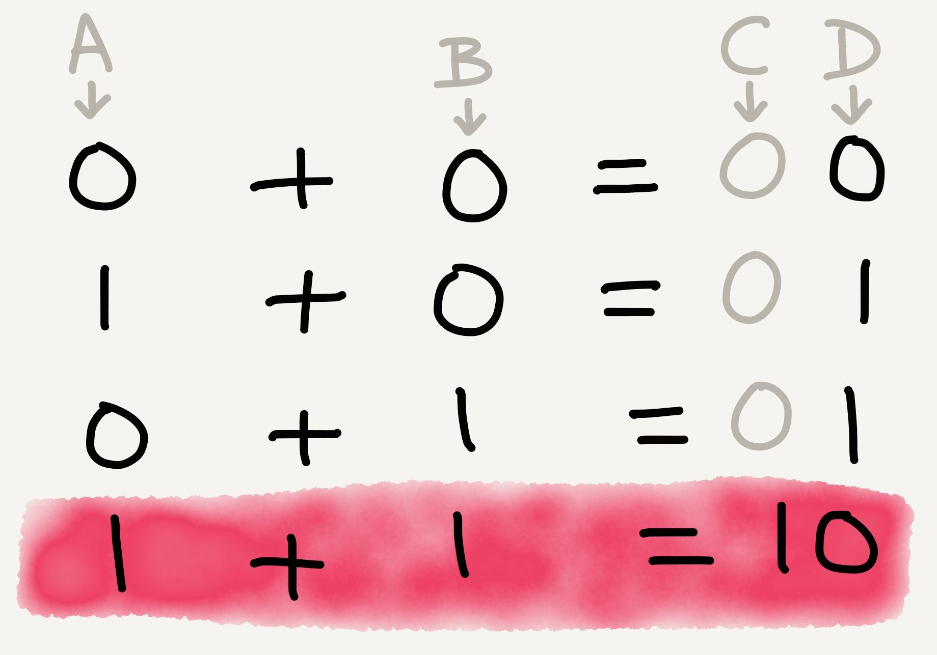 Adding binary numbers together
If you take the truth table from the logic gate diagram above, and replace TRUE with 1 and FALSE with 0, you’ll arrive at precisely the binary addition table above.
And so, out of the elemental logic gates XOR and AND, we have built a half adder , a circuit that takes two binary digits and tells you the sum. It can only add 0 + 0, 0 + 1, and 1 + 1, but that’s okay; those are the only things you can add in binary anyway.
The beautiful thing about this arrangement of logic gates is that it doesn’t have to be thought of purely in terms of AND, and XOR gates. You can arrange two half adders like this, for example, to get a full adder , which lets you add three binary digits together:
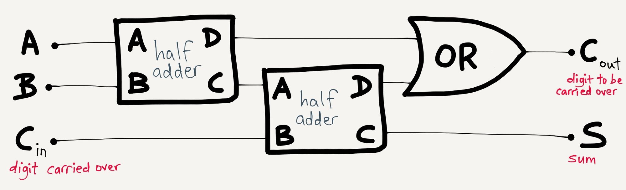 Adding two half adders and an OR gate together
Then you can arrange full adders to make what are called ripple-carry adders , which let you add two binary numbers of any number of digits together. Here’s one that lets you add two 4-bit binary numbers together:
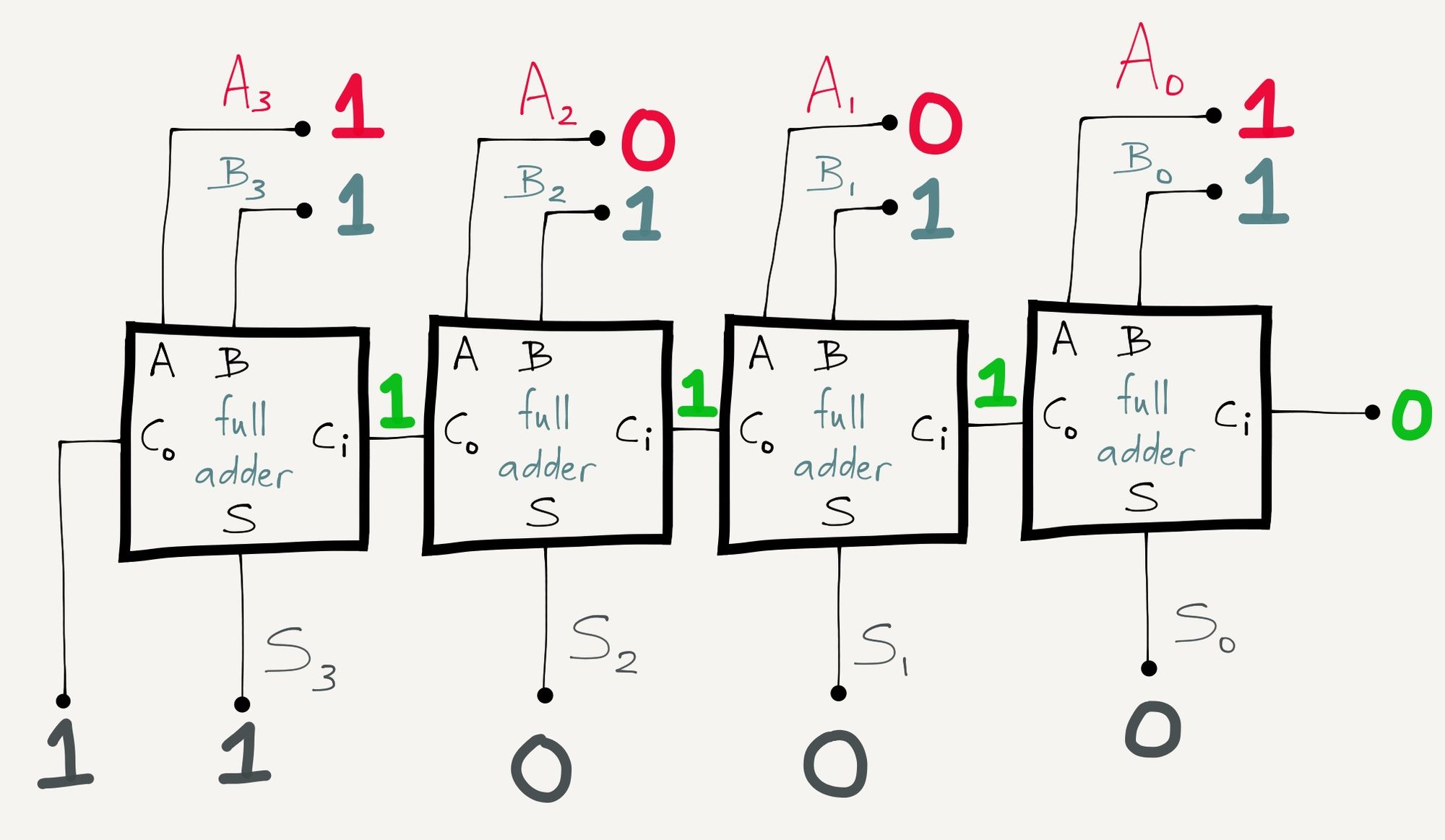 Nine (1001) plus fifteen (1111) equals twenty-four (11000)
Look, that thing can add up to 1 + 15 + 15!
As you build more and more complex configurations of logic gates upon one another, you stop thinking about NOT, XOR and AND, and you start thinking about adders. Put many adders together and you get an arithmetic logic unit (ALU). Put many ALUs together and combine them with other configurations of logic gates, and eventually, you get a central processing unit (CPU).
Underlying all the computational power of today’s CPU is the humble logic gate, but by the time we’re thinking on the level of CPUs, we’re no longer thinking about individual logic gates. The logic gates themselves are no longer relevant. What’s relevant are the layers we’ve built above the logic gates that allow us to store and manipulate data.
Low and High Levels of Abstraction
Think about a typical desktop computer. It’s got a screen, a keyboard, a mouse, a processor and some speakers, at the minimum.
How many keys do you have on your keyboard? If you have a full-size 104-key keyboard, think about the minimum number of 1s and 0s needed to transmit any given keystroke. (Answer: eight.) Imagine your keyboard transmitting sets of eight 1s and 0s through the wire into your CPU, and your CPU sending that input signal through millions of logic gates, and spitting out another set of 1s and 0s in order to display that letter on the screen… the amount of computation involved would overwhelm the human mind. It’s a wonder we manage to get computers to do anything at all.
That’s not how most software engineers engage with computers, though. If programmers had to think about how to read individual key presses from your keyboard in this manner, we’d never have gotten word processors, Photoshop, or Counter-Strike. Fortunately, they don’t have to do that.
Engaging with the computer on the level of 1s and 0s is a really low-level way of operating. If you’re directly feeding the CPU 1s and 0s, you’re probably working with machine code. Machine code is so difficult to work with that there’s a mnemonic version, assembly language, that lets us write in something vaguely recognisable as human language. You write your code in assembly, run what you’ve written through an assembler, and the assembler spits out machine code.
This is what computer scientists and software engineers refer to as abstraction. In computing parlance, assembly provides a layer of abstraction on top of machine code.
Even assembly is unwieldy. The Wikipedia page for low-level programming language gives an example of a Fibonacci calculator written in x86 assembly (it should be noted that there’s no one “assembly language” — each CPU architecture has its own):
fib:
  mov edx, [esp+8]
  cmp edx, 0
  ja @f
  mov eax, 0
  ret

@@:
  cmp edx, 2
  ja @f
  mov eax, 1
  ret

@@:
  push ebx
  mov ebx, 1
  mov ecx, 1

@@:
  lea eax, [ebx+ecx]
  cmp edx, 3
  jbe @f
  mov ebx, ecx
  mov ecx, eax
  dec edx
  jmp @b

@@:
  pop ebx
  ret
What this code does is calculate the nth Fibonacci number. eax , ebx , ecx and edx are registers in the CPU that store data for quick processing. The code uses these registers to store the answer to intermediate steps of the Fibonacci sequence, pulls that data out of the registers to do computations on them, and then spits out the answer into the ebx register.
On the same Wikipedia page, you’ll find the same Fibonacci calculator written in C (I’ve modified the variable names):
unsigned int fib(unsigned int n) {
  if (n <= 0) return 0;
  if (n <= 2) return 1;

  unsigned int first_number, second_number, current_total;
  first_number = 1;
  second_number = 1;
  while (1) {
    current_total = first_number + second_number;
    if (n <= 3) return current_total;
    first_number = second_number;
    second_number = current_total;
    n--;
  }
}
Here, instead of manipulating data in registers in the CPU, the code simply uses the variables first_number, second_number and current_total, much like you would use them in an algebra problem. Where in the CPU does the code keep the values of the variables first_number, second_number and current_total? You don’t know, because not knowing makes your life easier. You get to refer to variables based on what you decide they’re called, not based on where they’re stored in the CPU.
In C, register allocation is abstracted away. A C programmer doesn’t have to think about it. When they’re done writing their C code, they compile it using a C compiler, and the C compiler will take care of which variable goes into which register. This is part of what makes C a higher-level language than assembly: there is a higher level of abstraction. Many other languages are higher-level still, and abstract away even more of the underlying CPU architecture.
Remember Guttag’s statement on abstraction: “The essence of abstractions is preserving information that is relevant in a given context, and forgetting information that is irrelevant in that context.”
The values of the variables are relevant to our computation, so we want to keep them in our code. Their locations in the CPU are irrelevant to our computation, so we want to forget them. We want to abstract them away.
Abstraction has costs. A high-level programming language allows for efficient thought, at the expense of efficient operation. The process of compiling, of turning high-level code into machine code, introduces inefficiencies; the compiler will do some things in a suboptimal fashion. However, the efficiency gained by working in a high-level programming language typically far outstrips the efficiency lost by suboptimal machine code.
A related type of cost is the leaky abstraction. One summer in college, I read the entire back catalogue of Joel Spolsky’s blog Joel on Software, where in a well-known post, he laid out the Law of Leaky Abstractions: “All non-trivial abstractions, to some degree, are leaky.” In effect, this means that however you build your abstraction layer, something that you’ve abstracted away will turn out to be important; the abstraction will leak, and the illusion that the abstraction perfectly represents the underlying architecture will be broken.
Modern life is full of abstractions, most of them leaky. Think about a subway map. Here’s Singapore’s:
 Map from Singapore’s Land Transport Authority website
Look at this section:
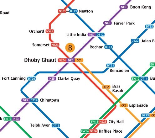 Close-up of the MRT map around Dhoby Ghaut
City Hall, Dhoby Ghaut and Newton are all are interchanges. City Hall is as good an interchange as I’ve ever seen in all my travelling: you get out of one train, cross the platform, and get onto the other train. That’s it. No stairs, no escalators, no long walkways. The abstraction is relatively leak-proof.
At Dhoby Ghaut, there’s a maze of escalators and travellators to bring you from one line to another. If you’ve ever travelled by subway in a city with a large subway system, you know this type of station (think Times Square in NYC, King’s Cross in London, or Friedrichstrasse in Berlin). The subway map simply indicates this as an interchange, but it’s not a pleasant experience changing at Dhoby Ghaut. The abstraction is a little leaky now.
At Newton, you have to exit the fare gates, walk a few metres inside the station, and re-enter the fare gates on the other side. This is a bigger leak still. And, if you look at the first map, there’s a similar interchange at Tampines. In the case of Tampines, you have to leave the station, walk outside, and re-enter what is effectively a different station a few hundred metres away.
Why? Subway maps are abstractions, and one of the things subway maps abstract away is the inconvenience of changing lines at interchanges. The East-West (green) and North-South (red) lines were built first, so the interchanges had the benefit of being designed based on the abstraction of the interchange and minimising the difficulty of changing lines.
The North-East (purple) and Circle (yellow) lines were built next, and because they had to be built around the pre-existing lines and any buildings that had sprung up in the meantime, connecting the new lines to the system required a series of walkways and escalators. The physicality of the train lines and the space they needed could no longer be abstracted to the same degree as they were with the first two lines.
Finally, the Downtown (blue) line was built. In order to connect the Downtown line with the other lines in the system, the abstraction of the interchange had to be massaged even further, because the walkways to connect existing train lines to the Downtown line could not even be made to reasonably fit inside the fare gate boundaries. The abstraction of the interchange has sprung a leak, and the subway map reflects it accordingly by altering the graphic design of the interchange stops:
 Interchange symbol on 2005 map
 Interchange symbol on 2017 map
 Public area interchange symbol on 2017 map
Leaky abstractions are bad from an operational point of view. They’re suboptimal, and they re-introduce irrelevant information into the system. When looking at the subway map and trying to figure out how to get from station A to station B, you don’t want to think about how far you have to walk at an interchange, how long the transfer might take, or whether you have to leave the station — all of which are really just additional abstractions on top of other things you don’t want to think about, like how much clearance a subway tunnel needs or how wide a walkway has to be to accommodate a rush-hour crowd.
On the other hand, leaky abstractions are intellectually a lot of fun. They reveal a great deal about the underlying structure of a system, all the layers below the leaky layer, and what information is in fact relevant and when. There’s a lot of stuff that you can abstract away for convenience, but that you still need to understand in order to fully grasp a system, and leaky abstractions show you where those things are.
Abstraction in other disciplines
I probably didn’t need to go into such detail, but I wanted to. Understanding abstraction in computing is how I came to understand abstraction more broadly as a concept, and I wanted to lay out some of the key principles of abstraction first, before I moved on to talking about abstraction in other fields.
Part of the reason abstraction is such a prominent idea in computer science, and a relatively poorly developed concept in other fields, is that people who work with computers professionally are taught explicitly about abstraction, early and often. Abstraction simplifies things for the coder. It helps to make tedious and repetitive code clean and elegant. It allows human beings to build complex applications, whether that’s Final Cut Pro or Player Unknown’s Battlegrounds, without having to reinvent the wheel or the half-adder (okay, that’s a really clumsy metaphor).
Conversely, in most of the typical liberal arts fields, abstraction is a relatively modern development in the history of their disciplines. Abstract art and abstract music, for example, only took root at the end of the 19th century, and diverges sharply from its predecessors in terms of beliefs and operating principles. Abstraction in these fields is, at best, one of many modes of operation, and at worst, a punchline. (I’ll admit I’ve done it too; I’ve definitely used Mark Rothko and Richard Serra as punchlines.) Understanding abstraction in computing, though, helped me to understand what it was that artists like Paul Klee and musicians like Arnold Schoenberg did that was so groundbreaking.
One of the things I want to do on this blog is to discuss how ideas and methods from one discipline can be relevant in other disciplines. This is where I’ll start: layers of abstraction. In the coming posts, I’ll be talking about abstraction in other fields, such as art, music, design, and linguistics.